React Ariaでアクセシビリティを考慮した実装をする(テストもやる)
React AriaはAdobeから提供されているReact向けのライブラリで、アクセシビリティを重視したコンポーネント作成を手助けしてくれるものです。React Ariaを使用することで適切な属性の付与と操作が可能になりますが、アクセシビリティの高いデザイン実装は自分で行う必要があります。今回はReact Aria(React Aria Components)を触ってアクセシビリティを学びながらStorybook上で動かし、テストも行ってみます。
React Ariaとは
React AriaとはAdobeがOSSで提供しているReact Spectrum Librariesのうちの1つで、特徴としては以下のようなものがあります。
- ヘッドレスコンポーネント(スタイルやレイアウトを独自に提供しない)
- アクセシブルなドラッグ&ドロップ、キーボードによる複数選択などの高機能を実現
- 全てのデバイスでのマウス、タッチ、キーボード、スクリーンリーダーのインタラクションを最適化する
- i18n対応
React Ariaで使用できるライブラリ
-
- ヘッドレスコンポーネント集。2のフックなどのAPIを使用して作られている。操作に応じてdata属性が追加されるため、それを使用して独自のスタイルを適用できる。
-
useButtonなどのフックを提供してくれるライブラリ。1をよりカスタマイズしたい場合に使用する。
-
- クロスプラットフォームに対応しているReact Hooksの状態管理ライブラリ。React Aria componentsは内部でReact Statelyを使用している。
なので、基本的にはReact Aria componentsを使用し、カスタマイズが必要な場合にReact AriaやReact Statelyを使用するという使い分けになります。
セットアップ
まずはNext.jsのプロジェクトを作成します。 CSSのスタイリングにはTailwind CSSを使います。
npx create-next-app react-aria-storybook次に、作成したプロジェクトでStorybookとReact Aria Comonentsを導入します。
bunx storybook@latest init
bun add react-aria-components
今回のプロジェクトのリポジトリは以下で見れます。
Comboboxコンポーネントの作成
簡単なComboboxコンポーネントを作成してみます。 コードとしては次のような感じです。
'use client';

import { useState } from 'react';
import {
  Button,
  ComboBox,
  Group,
  Input,
  Label,
  Popover,
} from 'react-aria-components';
import { ListBox } from './ListBox';

export type Option = { id: number; name: string };

const options: Option[] = [
  { id: 1, name: 'Aardvark' },
  { id: 2, name: 'Cat' },
  { id: 3, name: 'Dog' },
  { id: 4, name: 'Kangaroo' },
  { id: 5, name: 'Panda' },
  { id: 6, name: 'Snake' },
  { id: 7, name: 'Tiger' },
  { id: 8, name: 'Zebra' },
  { id: 9, name: 'Elephant' },
  { id: 10, name: 'Giraffe' },
];

export const Combobox: FC = () => {
  const [selectedOption, setSelectedOption] = useState<Option | undefined>(
    options[0],
  );

  const handleSelectOption = (id: Key) => {
    const option = options.find((option) => id === option.name);
    if (!option) return;
    setSelectedOption(option);
  };

  return (
    <div className='grid grid-cols-1 gap-6'>
      <dl className='flex gap-2'>
        <dt>selected:</dt>
        <dd className='font-bold text-blue-700'>{selectedOption?.name}</dd>
      </dl>
      <ComboBox
        className='grid grid-cols-1 gap-1.5'
        onSelectionChange={handleSelectOption}
      >
        <Label className='text-sm'>Favorite Animal</Label>
        <Group className='cursor-pointer rounded border border-gray-300 bg-white px-1.5 py-1 focus-within:outline hover:outline focus-within:outline-2 focus-within:outline-gray-500 hover:outline-2 hover:outline-gray-500 focus-within:outline-offset-2 hover:outline-offset-2'>
          <Input className='cursor-pointer outline-none' />
          <Button aria-label='候補を表示'>▼</Button>
        </Group>
        <Popover>
          <ListBox options={options} />
        </Popover>
      </ComboBox>
    </div>
  );
};中で使用しているListBoxコンポーネントは次のようになっています。
import type { FC } from 'react';
import {
  ListBox as RACListBox,
  ListBoxItem as RACListBoxItem,
  composeRenderProps,
  type ListBoxItemProps,
} from 'react-aria-components';
import type { Option } from './Combobox';

const ListBoxItem = ({
  id,
  children,
  textValue,
  ...props
}: ListBoxItemProps) => {
  return (
    <RACListBoxItem
      {...props}
      id={id}
      textValue={textValue}
      className='flex cursor-pointer px-2 py-0.5 data-[focused]:border-gray-500 data-[focused]:border-y-2 data-[focused]:bg-blue-100 data-[focused]:py-0'
    >
      {composeRenderProps(children, (children, { isSelected }) => (
        <>
          <span className='flex flex-1 items-center gap-2 truncate font-normal'>
            {children}
          </span>
          <span>{isSelected && '✔'}</span>
        </>
      ))}
    </RACListBoxItem>
  );
};

type Props = {
  options: Option[];
  'aria-label'?: string;
};

export const ListBox: FC<Props> = ({ 'aria-label': ariaLabel, options }) => {
  return (
    <RACListBox
      aria-label={ariaLabel}
      className='max-h-52 w-48 overflow-auto rounded border border-gray-500 bg-white shadow-md'
    >
      {options.map((option) => (
        <ListBoxItem key={option.id} id={option.name} textValue={option.name}>
          {option.name}
        </ListBoxItem>
      ))}
    </RACListBox>
  );
};
Storybookの作成とテスト
ComboboxとListBoxのStorybookを作成します。
import { expect } from '@storybook/jest';
import type { Meta, StoryObj } from '@storybook/react';
import { userEvent, within } from '@storybook/testing-library';
import { Combobox } from './Combobox';

const meta = {
  component: Combobox,
  title: 'components/combobox/Combobox',
} satisfies Meta<typeof Combobox>;

export default meta;
type Story = StoryObj<typeof meta>;

export const Default = {
  play: async ({ canvasElement }) => {
    const canvas = within(canvasElement.ownerDocument.body);

    // comboboxにフォーカスが当たった時のスタイルを確認する
    await userEvent.tab();
    expect(canvas.getByRole('combobox')).toHaveFocus();
    expect(canvas.getByRole('group')).toHaveStyle({
      'outline-width': '2px',
      'outline-offset': '2px',
    });

    // optionを選択して値が変わることを確認する
    await userEvent.click(
      canvas.getByRole('button', { name: '候補を表示 Favorite Animal' }),
    );
    await userEvent.click(canvas.getByRole('option', { name: 'Cat' }));
    expect(canvas.getByRole('combobox')).toHaveValue('Cat');

    // typeして値が変わることを確認する
    await userEvent.clear(canvas.getByRole('combobox'));
    await userEvent.type(canvas.getByRole('combobox'), 'Dog');
    await userEvent.keyboard('{arrowdown}');
    await userEvent.keyboard('{enter}');
    expect(canvas.getByRole('combobox')).toHaveValue('Dog');
  },
} satisfies Story;
play関数を使用し、ユーザーがリストボックスを開いて選択するまでの操作をテストしています。
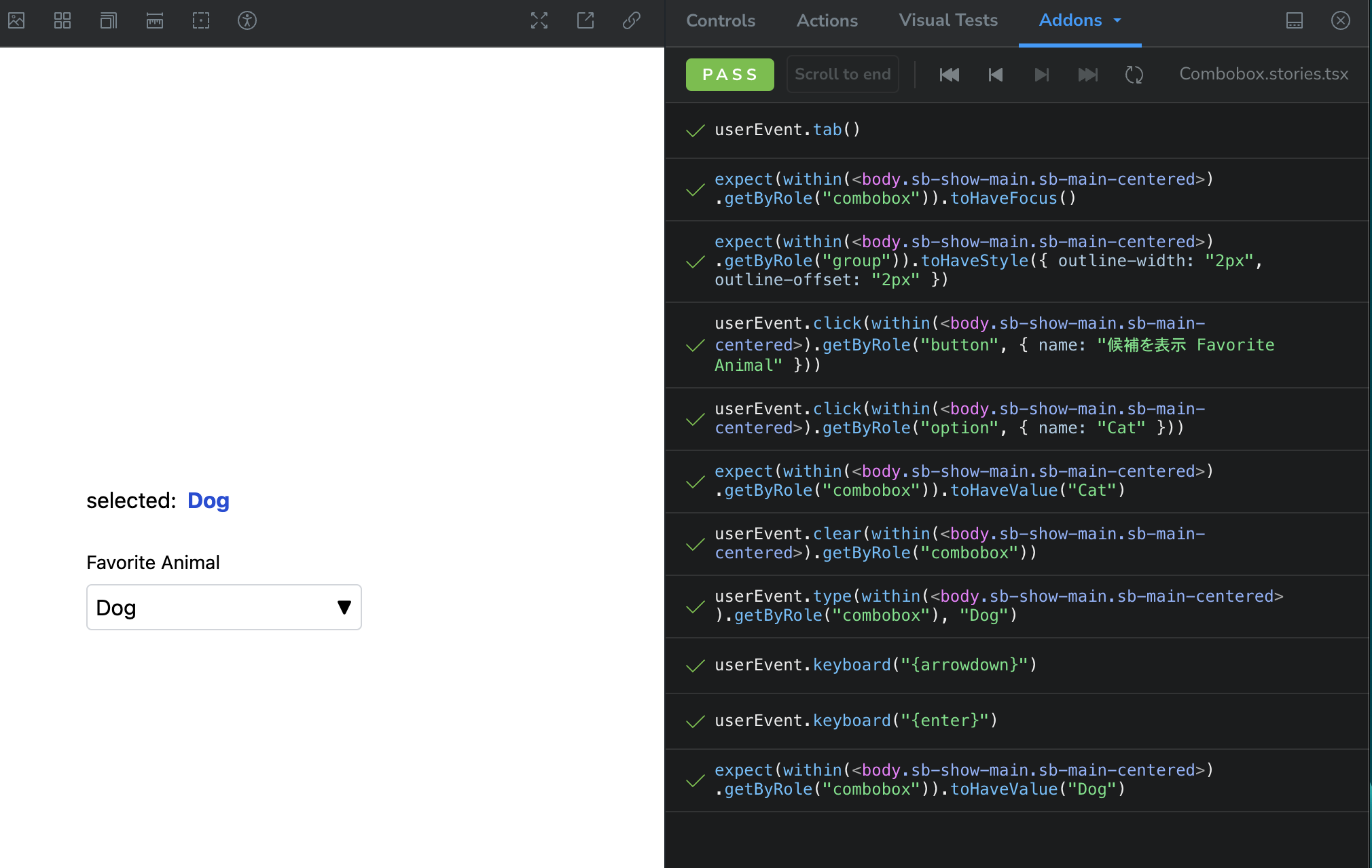 Storybook上でplay関数を使用した操作のテスト結果
import { expect } from '@storybook/jest';
import type { Meta, StoryObj } from '@storybook/react';
import { userEvent, within } from '@storybook/testing-library';
import { ListBox } from './ListBox';

const meta = {
  component: ListBox,
  title: 'components/combobox/ListBox',
} satisfies Meta<typeof ListBox>;

export default meta;
type Story = StoryObj<typeof meta>;

export const Default = {
  args: {
    options: Array.from({ length: 10 }, (_, i) => ({
      id: i,
      name: `Option ${i}`,
    })),
  },
  render: ({ options }) => {
    return <ListBox aria-label='候補' options={options} />;
  },
  play: async ({ canvasElement }) => {
    const canvas = within(canvasElement);

    await userEvent.click(canvas.getByRole('option', { name: 'Option 0' }));
    await userEvent.keyboard('{arrowdown}');

    expect(canvas.getByRole('option', { name: 'Option 1' })).toHaveFocus();
    expect(canvas.getByRole('option', { name: 'Option 1' })).toHaveStyle({
      'border-top-width': '2px',
      'border-bottom-width': '2px',
    });
  },
} satisfies Story;
LitBoxでもキーボード操作を伴うテストを行っています。
また、@storybook/addon-a11yのアドオンを使用してアクセシビリティのテストも行います。
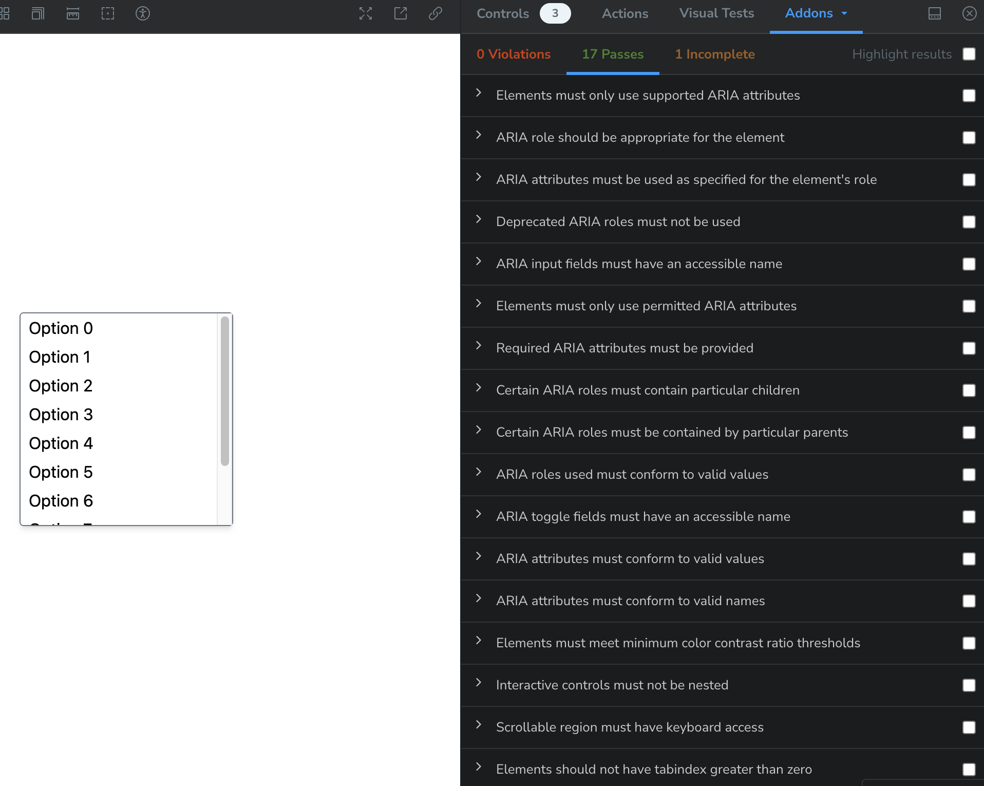 Storybook上でのアクセシビリティのテスト結果
めっちゃテストされてる
Webページとして公開してあるStorybookで確認が可能です。
デザイン観点のアクセシビリティについて
今回はデザイン面でのアクセシビリティとしてはAPGのAccessibility Featuresを参考に実装しました。
-
Groupの中身にフォーカスが当たった時またはホバーされた時に2pxのスペースを伴う2pxのフォーカスリングが表示される
APGにある説明:
To make it easier to perceive when the combobox receives focus, focus creates a 2 pixel focus ring around both the input and button elements with 2 pixels of space between the focus ring and the combobox.
hover:outline hover:outline-2 hover:outline-offset-2 hover:outline-gray-500 focus-within:outline focus-within:outline-2 focus-within:outline-offset-2 focus-within:outline-gray-500の部分hover:とfocus-within:はTailwind CSSで使用できる擬似クラス
-
focusとhoverのスタイルが一致するようにしてユーザーが要素をクリック可能であることが認識できるようにする
APGにある説明:
To make it easier to perceive that either the input or button can be clicked to open the listbox, hover causes the same styling as focus.
- ユーザーがマウスカーソルを入力フィールドやボタンの上に置くと、その要素はフォーカス(選択)されているかのように見えるため、ユーザーはその要素がクリック可能であることを直感的に理解できるようになる
-
コンボボックスやリストの上にカーソルを置くと、カーソルがポインタに変わる
APGにある説明:
To help people with visual impairments identify the combobox as an interactive element, the cursor is changed to a pointer when hovering over the combobox or list.
-
フォーカスやホバーが当たっていたり、選択されているオプションの上下には2pxのボーダーを表示し、その分の2pxのパディングを減らす
APGにある説明:
To make it easier to distinguish the selected listbox option from other options, selection creates a 2 pixel border above and below the option.
Note: Because transparent borders are visible on some systems with operating system high contrast settings enabled, transparency cannot be used to create a visual difference between the element that is focused and other elements. Instead of using transparency, the focused element has a thicker border and less padding. When an element receives focus, its border changes from zero to two pixels and padding is reduced by two pixels. When an element loses focus, its border changes from two pixels to two and padding is increased by two pixels.
py-0.5 data-[focused]:border-gray-500 data-[focused]:border-y-2 data-[focused]:bg-blue-100 data-[focused]:py-0の部分- 透明性(opacityやrgbaでの半透明色の使用など)を使ったスタイリングを行うとOSの高コントラスト設定が有効な場合に見えにくくなったり、全く見えなくなる場合がある(実験的な機能としてCSSのメディア機能にprefers-reduced-transparencyがあったりする)
- そのため、透明性のあるスタイルは使わずにボーダーや不透明なカラーを背景色にするなどの設定することが必要
上記のように、aria属性の付与やキーボード操作などの他にも、デザイン観点でもアクセシビリティを意識することが必要です。 ユーザーが操作を行った時に、今どこで操作を行っているのか、次に何の操作が期待できるか、操作に手こずるようなUIになっていないか、見やすいコントラスト比になっているかなどを意識することで誰にとっても使いやすいサイトになるでしょう。
終わりに
今回はReact Ariaを使ってアクセシブルなコンポーネントを簡単に作成することができました。プロダクションレベルで使用するにはもう少しカスタマイズが必要になると思います。 しかし、アクセシビリティを実現する上でのaria属性の付与やキーボード操作などは一から実装すると結構大変でコンポーネントが大きくなりがちなので、このようなライブラリを使って簡潔にアクセシビリティを向上できるのはとても助かるなと思いました。
また、Storybookを使用したplayやaccessibilityのテストは実際にUIを見ながら確認できるので非常に開発体験が良いです。今後業務でも使用できたら良いなと思います。
余談
Playwrightでもアクセシビリティのテストが可能なので、試しにやってみました。
import AxeBuilder from '@axe-core/playwright';
import { expect, test } from '@playwright/test';

test('combobox page', async ({ page }, testInfo) => {
  await page.goto('/combobox');

  const accessibilityScanResults = await new AxeBuilder({ page }).analyze();
  await testInfo.attach('accessibility-scan-results', {
    body: JSON.stringify(accessibilityScanResults, null, 2),
    contentType: 'application/json',
  });

  await expect(
    page.getByRole('heading', { level: 1, name: 'Combobox' }),
  ).toBeVisible();
  await expect(
    page.getByRole('combobox', { name: 'Favorite Animal' }),
  ).toBeVisible();
  expect(accessibilityScanResults.violations).toEqual([]);
});@axe-core/playwrightをinstallすればすぐに実行可能testInfoを使用すればaccessibilityテストの結果のレポートを細かく確認できる- テストしている項目としてはaxc-coreのGitHubで公開されている
a11yのテストという観点でStorybookとの使い分けとしては、
- StorybookのアドオンはStoryを表示している時にのみ確認可能(実際にどの要素に対してどのテストをしているかがわかりやすい)
- そのため、全てのStoryを一度に確認したい場合は
test-runnerとaxe-playwright使用すれば可能
- 上記をやるならPlaywightでいい気がする
結論:Storybookではアドオンを追加し、Playwrightでもa11yのテストをする でいい気がしました🙂↕️
知見が浅いのでそうじゃない!と思った方はぜひ教えて欲しいです!